Header
Divider lines

Lines direct focus, define space, and create visual rhythm. It’s a simple way to separate HP from just any brand. 


Overview

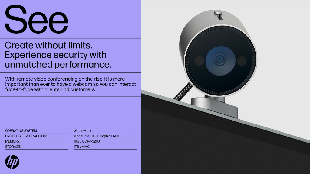
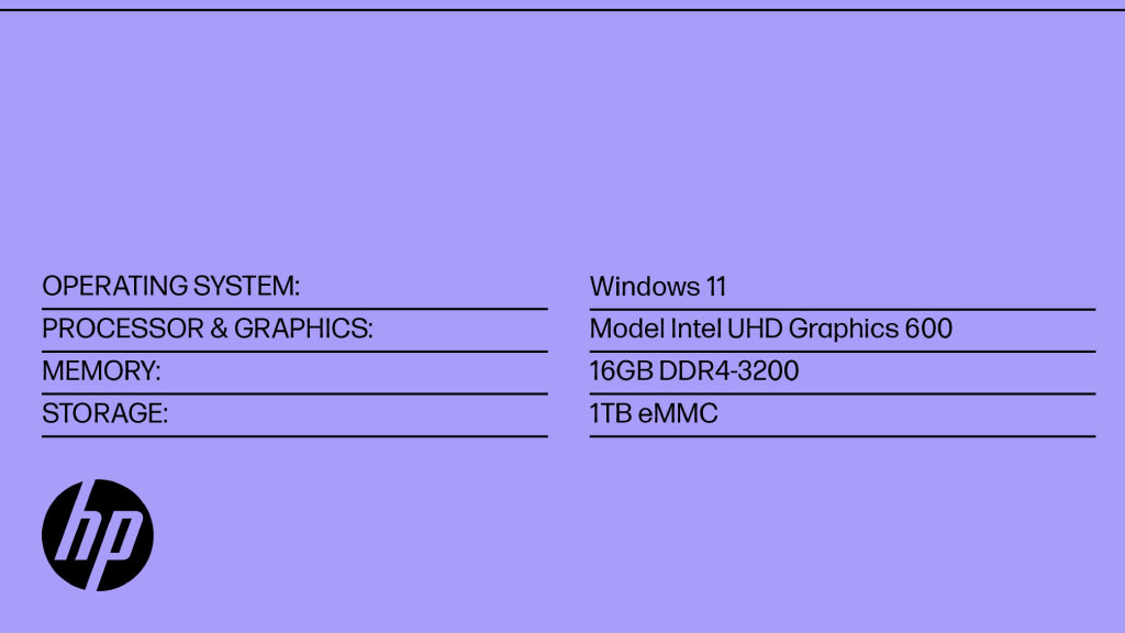
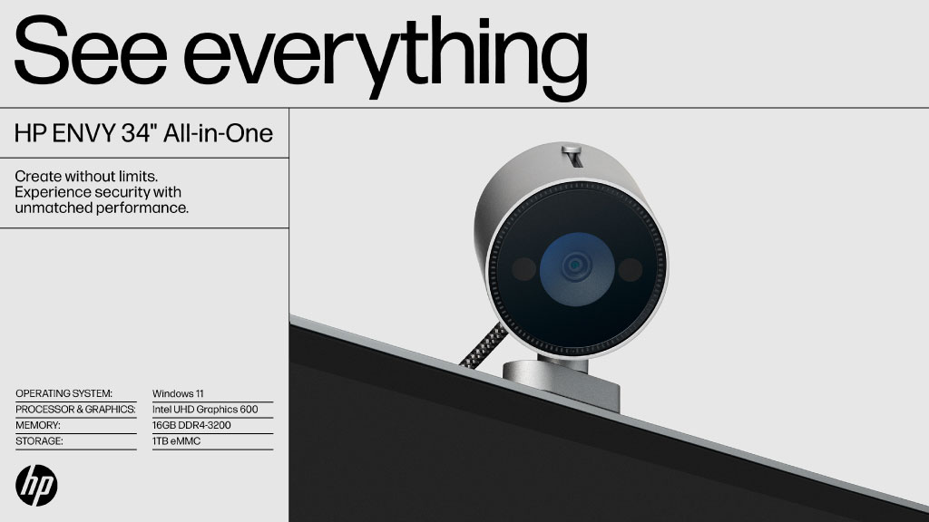
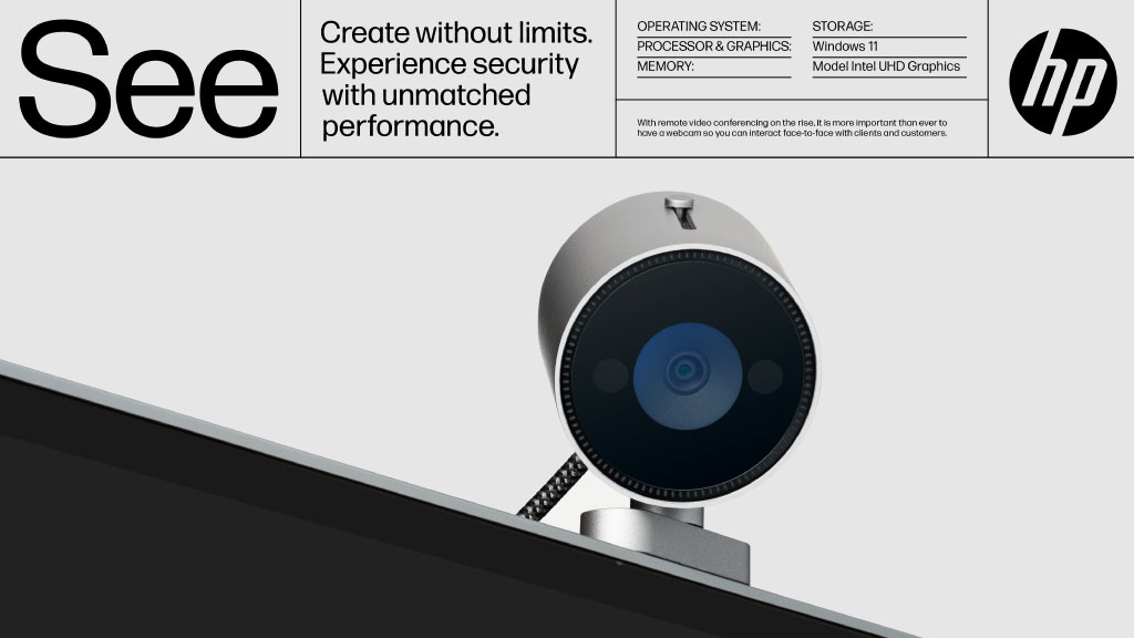
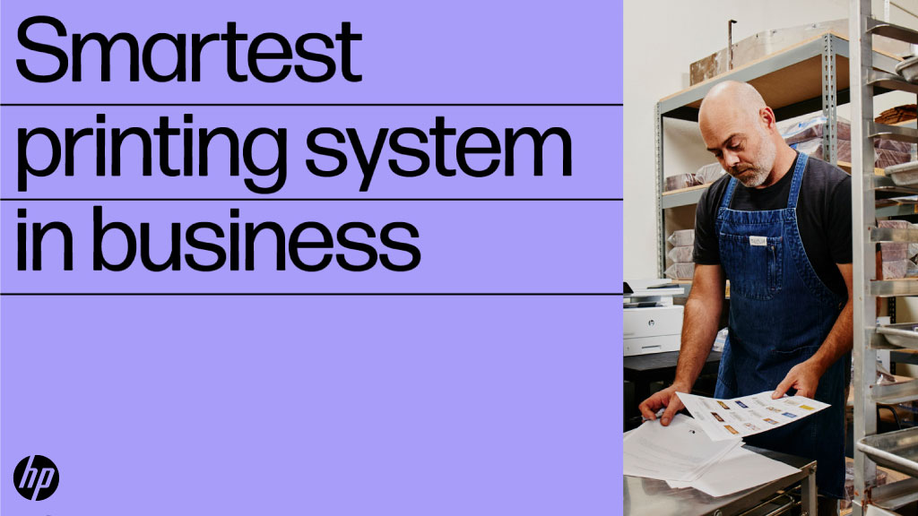
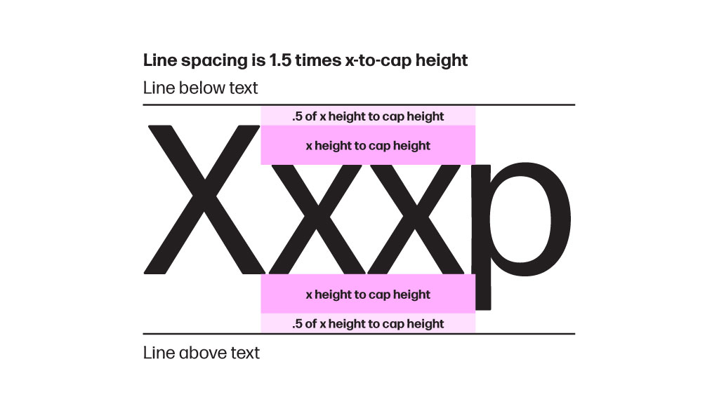
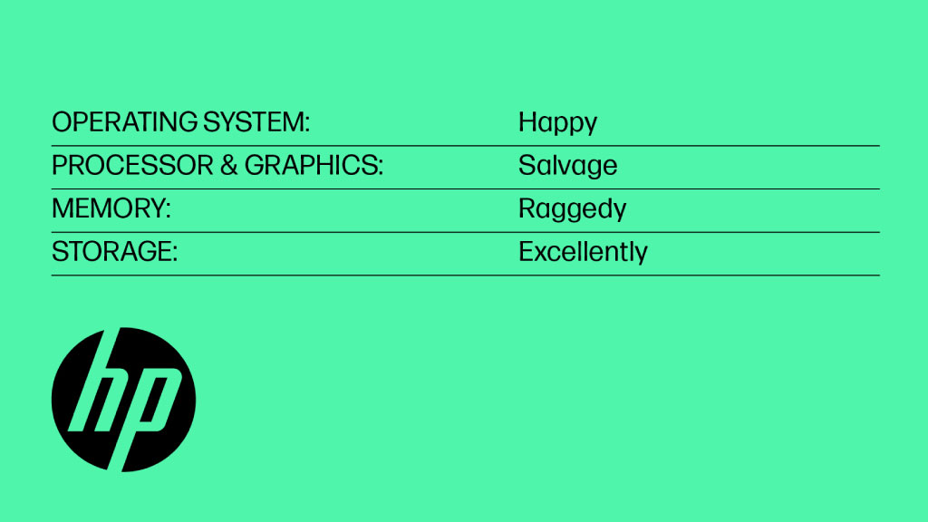
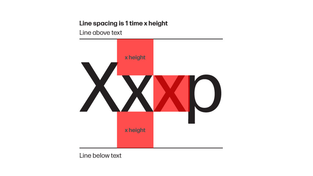
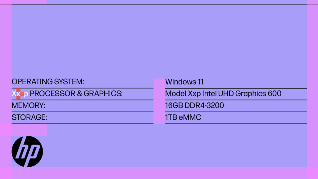
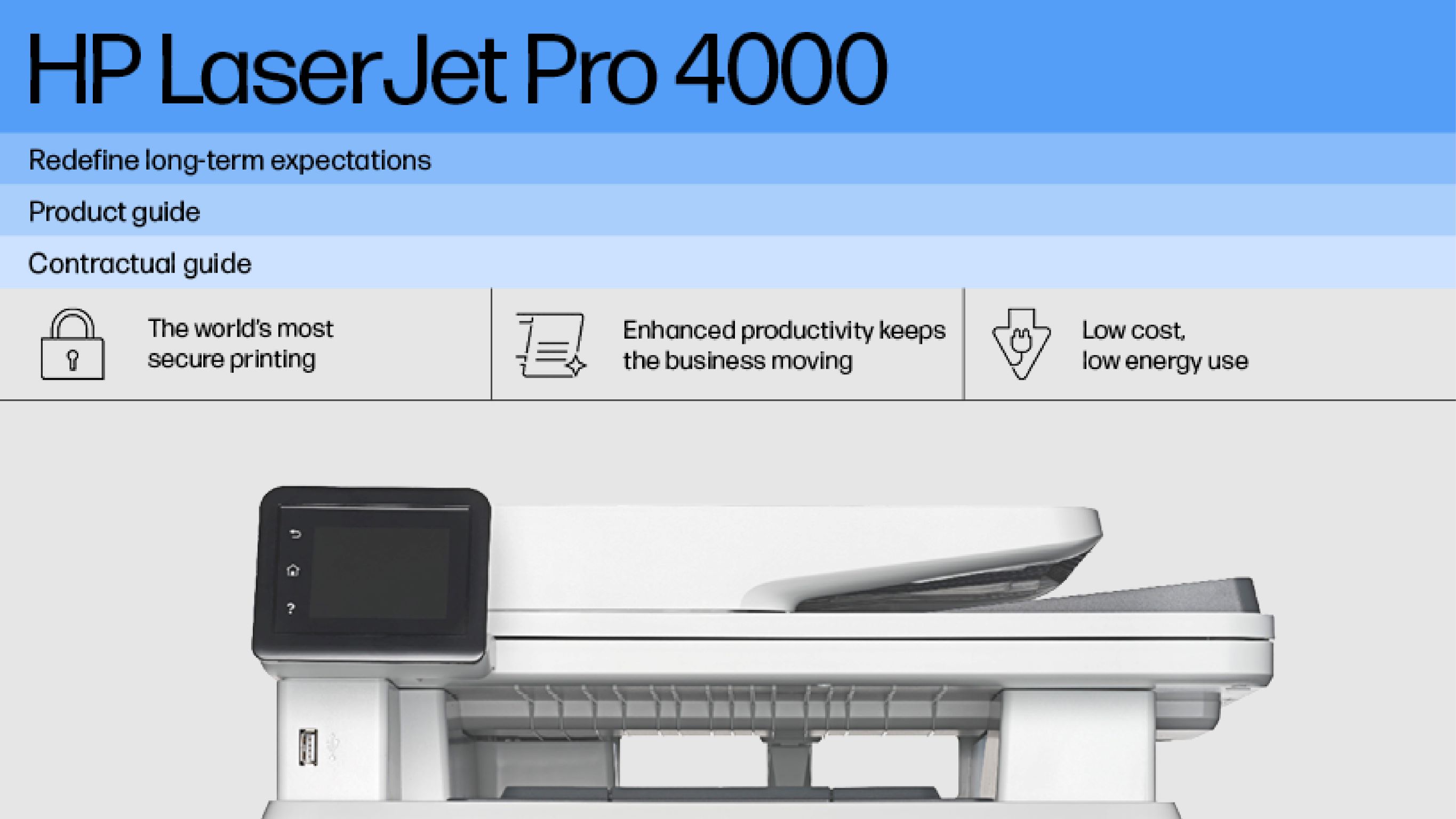
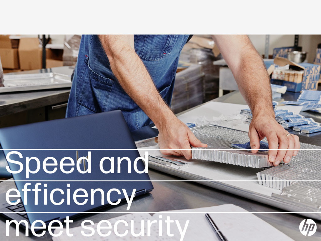
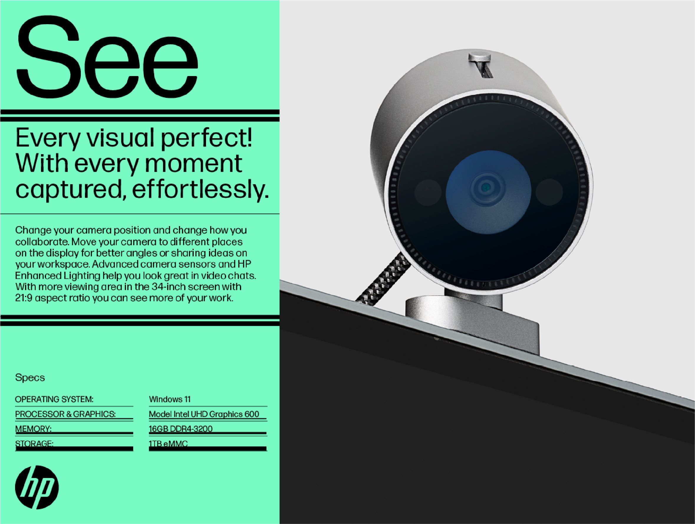
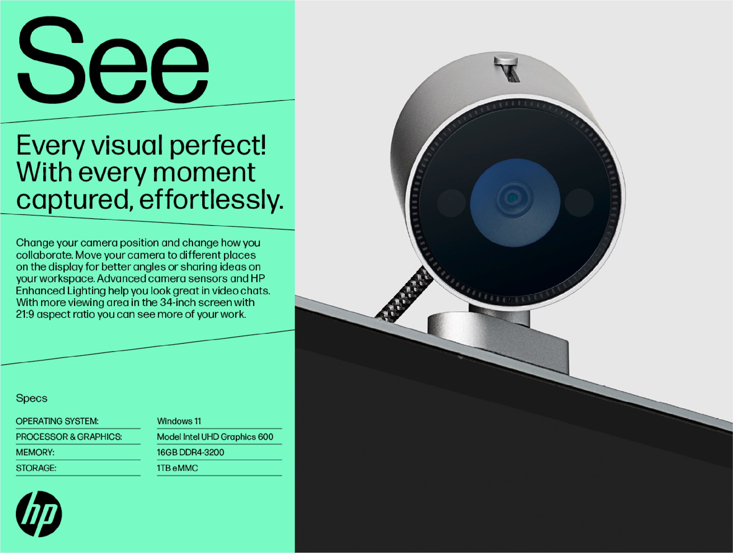
Lines perform a structural and organizational role in HP’s visual language. They divide layouts into separate, bite size sections or modules but also organize and structure content within modules. They are always functional and should not be misused as decorative features.

Lines are either vertical or horizontal and are either black or white—matching text and logo. 

Lines should feel balanced with the type around it, not too thin nor too thick. They appear in only one weight per layout—light but visible—usually 0.5–2 points.

  • Module defining lines

  • Module organizing lines

  • Structuring lines

  • List structuring lines


Module defining lines

Lines that define modules extend edge to edge. They are always black or white, matching the logo.

Lines partner with color to define module borders, but they don’t reinforce borders already defined by color change. 

All lines are either vertical or horizontal in a layout and can subdivide modules.

The space separating the module lines is equal to the layout margin. 

For more details on line spacing access the Lines guidelines.

  • Lines that define modules extend edge to edge.

  • All lines are either vertical or horizontal.

  • Lines partner with color to define module borders.

  • Vertical and horizontal lines can subdivide modules.


Module organizing lines

Lines that organize modules only extend to the module margin, not edge to edge.

Module organizing lines group and separate like content. Lines and icons have the same weight in a layout. And they both match the color of the text. 

The space between modules is equal to the layout margin.

For more details on line spacing access the Lines guidelines.

 
Annotating lines

Annotating lines should connect information with icons or images in a layout. Annotating lines can be more free form than other lines.

  • Lines that organize modules only extend to the module margins.

  • Icon lines have the same weight as other lines in the layout.

  • Icons are always black, matching the color of text and other lines.

  • Annotating lines should connect information with icons or images.


Headlines and quotes structuring lines

Lines that structure a single headline or quote add graphic emphasis and make the text more interesting. 

  • They provide a container text which helps define the space in a layout. 
  • They add structure to layouts so headlines and quotes aren’t floating. 

Full-bleed horizontal lines can structure a short headline or single word placed over photo. And when over photos, lines should not cover more than 50% of the layout.

Lines should not obscure people or products, including covering faces or the majority of a product.

When creating a headline with line emphasis there should not be a subhead or any additional copy. 


Spacing

Line spacing is 1.5x length of one “p” or “y” descender extended above and below “x” height. Lines should be spaced equally above and below the x height. The line spacing should be compact but leave a visible gap between lines. 

For more details on line spacing access the Lines guidelines.

  • Lines that structure a single headline or quote add emphasis to the text.

  • Lines can structure a short headline or single word placed over photo.

  • No other copy needed when a headline has line emphasis.

  • Line spacing is 1.5x length of one “p” or “y” descender extended above and below “x” height.


List structuring lines

Lines used to give structure to lists only extend to module margin. 

Lists can include one or more columns depending on content and width of layout. Columns always have equal widths.

Lines in lists need extra space because it’s often more dense and the type is smaller. Line spacing is one “x” height above “x” height and below baseline OR equally space lines above and below “x” height with leading at 1.5x type size.

For more details on line spacing access the Lines guidelines.

  • Detail of list structuring lines: 2 columns

  • Detail of list structuring lines: 1 column

  • Line spacing is one “x” height above “x” height and below baseline OR equally space lines above and below “x” height with leading at 1.5x type size.

  • Lines in lists need extra space because it’s often more dense and the type is smaller.


Vertical lines

While our visual identity revolves around horizontal lines, vertical lines support specific design needs.

Vertical lines serve as a skeleton or wireframe for traditional color-blocked layouts or backgrounds. You can apply them over full-bleed photos or neutral single-color backgrounds.

You can also use vertical lines to separate long, horizontal or scrollable layouts, for instance web pages, editorials, or content-heavy charts.


Lines and photos

While overlapping happens, avoid crossing the line for these photo instances. 

Headline

Do

Dont

Use a headline or single word for text-over-image treatments.

Don’t include additional text in people photography layouts.

Contrast

Do

Dont

Leverage areas of clear space and high contrast to keep the image in focus.

Don’t lose line visibility from weak contrast or too much going on.

Type

Do

Dont

Try to frame type by using lines strategically. Text takes up less than 50% of the layout.

Don’t take up more than 50% of layout.

Product

Do

Dont

Minimal overlap is okay over product photography.

Don’t place lines directly over the majority of the product.

Faces

Do

Dont

Faces always visible.

Don’t cover faces or obscure subjects.

Placement

Do

Dont

Type, graphics, and lines are always set plainly over an image.

Don’t put text or graphics behind people or products.

  • Headline

  • Contrast

  • Type

  • Product

  • Faces

  • Placement


Do’s and don’ts

Color

Do

Dont

Only use black or white lines (and match the type).

Don’t use a line color other than black or white (and always match with the type).

Weight

Do

Dont

Keep all lines the same weight for a clean, consistent look.

Don’t assign multiple weights per line or more than one line per section.

Color or Lines

Do

Dont

Separate content using color stacking or lines.

Don’t use both color stacking and lines to separate content.

Edge to Edge

Do

Dont

Take lines to the edges, except for listed sections.

Don’t tack space on the edges (unless it’s a list).

Layout

Do

Dont

End lines at the edges of the layout section.

Don’t cross into faces in photography or go over products.

Orientation

Do

Dont

Integrate horizontal lines for effect (with some vertical exceptions).

Never incorporate diagonal lines (unless it’s a DON’T example like this).

  • Color

  • Weight

  • Color or Lines

  • Edge to Edge

  • Layout

  • Orientation