Header
Color

Color choice matters.

It’s a way to evoke emotion, attract attention, or make a statement.


Color system

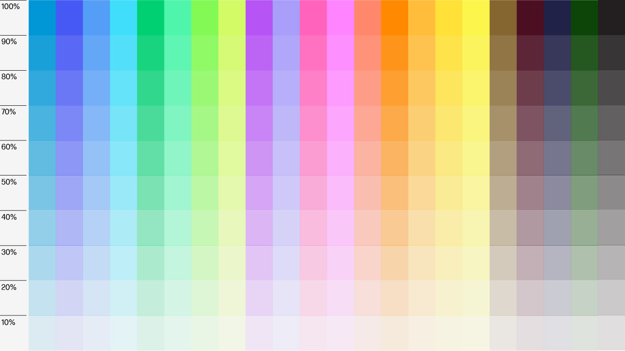
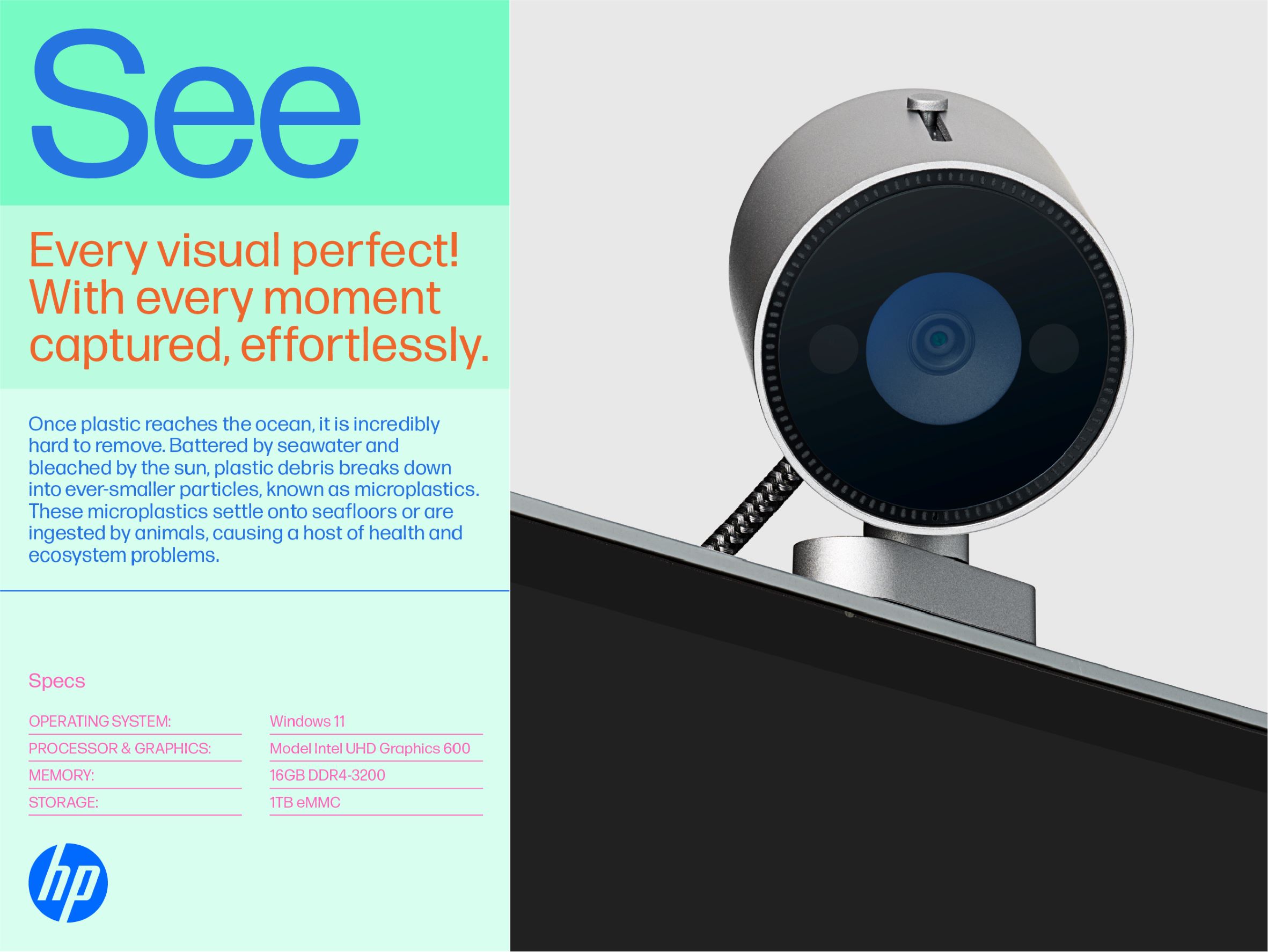
Blue is our core brand color and holds equity. However, we cannot expect it to convey all types of emotions. And while incorporating additional colors is important to increase brand visibility and extend our identity, we need to create space for attributes like stability and heritage to also shine.

We’ve created a Color System that helps us articulate a larger range of expression. A way to keep building visual uniqueness to our brand in crowded spaces and allowing HP blue to be in the spotlight in corporate creative and environments. 


Core color palette

Core follows a more restrained palette limited to HP blue and a few colors that fit with the use of our blue logo.  The first set of colors on the left are considered the primary options to achieve a true corporate look & feel. The other three options are considered secondary and give a bit more flavor to your corporate creative. 

Use the Core Palette in all HP Corporate creative and environments, including Employee Communications. Every time we present HP as a company, we’ll use this palette to make sure HP Blue is in the driving seat.

Choose one main color and use it in combination with Tints of the same color, or work with Lines, and with Neutrals to give rhythm and create visual hierarchy to your content.

The HP logo is always set in HP Blue with this Core Palette, except when the background color obscures legibility. In cases of low contrast, use white.


Expressive color palette

Inspired by our iconic ink and the creators who use it, the curated Expressive Color Palette visually tells our backstory and distinctly feels HP.

Use the Expressive Palette in all demand generation creative. Choose one color from our 21 diverse base hues for your design.

Bright colors give more energy and distinctiveness to creative, while the dark options feel more serious. We recommend leaning towards bright colors over the dark options as much as possible, to differentiate HP in a crowded space.

When using the Expressive Palette, use the black or the white HP logo as noted in the image below and always matching the color used for type. 


Tints

Make monochromatic more dynamic. Tints blend the harmony of a single hue with a crescendo of shades.

Commit to just one hue within the Color System. Repeat the single color in gradient tints.

Always start at 100% saturation for transitioning tints. Use the layout scale and your design discretion to assign tint increments.

The example shows 10% increments.


Neutral colors

Neutral tones allow juxtaposed information and imagery to pop. The HP Standard Cream and HP Standard Gray give bright colors, type, and product imagery a backdrop to stand out.

  • Use HP Standard Cream for type backgrounds.
  • Use HP Standard Gray for product photography or for type (when not combined with product photography).
  • Find imagery that contrasts well with each color.
  • In specific situations, a white background may work better than cream or gray (e.g. multi-page documents or long slide decks). Use only as necessary. 

  • HP standard cream R=242 G=235 B=220.

  • HP standard gray R=230 G=230 B=230.


Color stacking

Color stacking takes a measure of creativity. Done right, it effectively adds depth.  

Start at 100% saturation for your color of choice (from the base hues of course).

Stack in stepped tints to create different sections within a layout.

Do a little math to scale it out. Figure out percentages by dividing 100 by the number of sections. Ex: A 4-color layout factors out to 100%, 75%, 50%, and 25% tints, since 100/4 = 25.

Use discretion for divider lines. These lines separate content and create sections within a given color. However, there’s no need for them if tints indicate the separate sections. (See Lines guidelines.)

Take a look at the four following examples of different color stack builds for reference. For other examples and more detailed instructions on color stacking, download the full Color guidelines

  • Divider lines separate the content to create different sections on 100% saturation.

  • Divider lines separate the top content at 100% saturation. 50% tint separates the specs section.

  • Only one divider line is necessary, since tints separate the rest of the layout. The top features 100% saturation. The tints step down to 75% and then 50%

  • Tints separate all the sections, starting at 100% and stepping down to 75%, 50%, and 25% tints. No divider lines needed.


Do’s and don’ts

Select colors with intention for your design execution. 

The system does not assign specific colors to specific products and is meant to be interchanged over time.

Take into account which colors you need and want to achieve your design goals. Use only neutral colors to set the tone for a quieter voice. 

When creating Intel assets, follow Intel’s Confusingly Similar guidelines for approved Intel versus Universal colors. Speak to your representative for further details.

Mixing Colors

Do

Dont

Use one color throughout at 100% saturation or with tints and standard cream.

Don’t mix colors in a single layout.

Sections

Do

Dont

Use base colors and tints in the correct order.

Don't break the correct order when applying tints to separate content.

Type Color

Do

Dont

Black should be the only color used for type (except for white type over photos).

Different-colored type distracts and lacks consistency.

Type Background

Do

Dont

When applying neutral color for type, use HP Standard Cream or HP Standard Gray.

Don’t use a darker or lighter color than our HP Standard Cream or HP Standard Gray.

Photo Background

Do

Dont

Use HP Standard Gray for product photography backgrounds.

Don’t use color backgrounds, gradients, or a color darker or lighter than our HP Standard Gray.

  • Mixing Colors

  • Sections

  • Type Color

  • Type Background

  • Photo Background


FAQ

These are some of the most frequent questions we receive regarding our color system and palettes. Make sure you are familiar with the guidelines displayed in this page. In case you still have questions, please reach out to the Brand Central team.

  • Will we still use HP blue? In which circumstances?
    HP blue can be used in all HP corporate creative and environments, including Employee Communications.
  • When and how to combine color and neutrals?
    Color blocks are used within layouts primarily in combination with Typography. A single color with gradual use of blocking and saturation is allowed. Neutral layout options are provided in the guidelines used exclusively when warranted. Please refer to the Color section for more explicit references to the use of color in both background treatment as well as layout.
  • Are certain colors best suited for particular product families or categories?
    The current color system is not meant to assign specific colors to specific products. Instead, the colors are meant to be used interchangeably over time. Any product can be any color if the context allows for it.
  • Does the color palette selected meet accessibility standards for contrast?
    The color palette selection included a review and testing using accessibility standards related to contrast. The guidelines include use of a black logo with black typography versus color typography.