Header
Logo

It’s more than a circle.

It’s the face of our brand.

The icon in our iconic legacy.


Logo colors

Our logo is iconic. It connects past progress to today's thinkers and creators. Sustaining the power of the HP logo through consistent color, quality, and placement is everyone's responsibility.

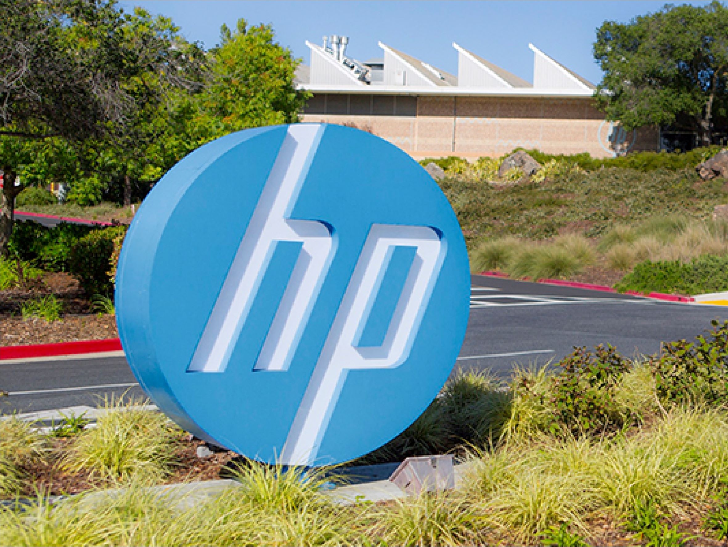
The blue logo should be the primary option for all corporate applications. Use the blue logo to proudly display our heritage and solid reputation everytime HP is presented as a unified company and in all employee communications.

Our rich color palette works as a way of making HP stand out in crowded spaces. Use the black logo in demand generation and all marketing communications requiring the use of an expressive look & feel. Never use the black logo in corporate creative and environments.

The white logo is the alternative to both the blue and the black logo. It should replace the blue logo in corporate applications where the blue logo isn’t legible. It should be used as a replacement to the black logo for darker colors, and always matching the color of the type in demand generation and marketing communications creative.

In all cases, ensure the background contrasts crisply through the “HP” letters.


Size

Logo sizing is more art than science. It varies based on different aspects of your layout like dimensions andproportions. But it also involves other elements in use like type size, amont of copy, and amount of white space.

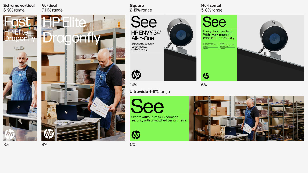
The logo should be easy to read but should not be too large and not too small. Appropriate size range varies for different layout proportions.

An initial logo size can be estimated by a percentage of the long edge of a layout:

  • Logos should not be smaller than 4% of a layout’s long edge.
  • 5–6% is a general minimum and good starting point for most layouts.
  • 10–16% is a general maximum.

When applied on it’s own (not within typical HP layout), the minimum print size recommended is 0.25” square or 6.35 mm square. And the minimum digital size recommended is 20 x 20 pixels at 72 ppi.


Clear space

Our logo sits comfortably, surrounded by even clear space. Provide equal amounts of clear space around the logo, measured by the layout margins.

This is the minimum amount of space the logo should have in relation to the edge of a layout. Add additional white space as need to optically correct for spaces that look or feel wrong.

When applied on it’s own (not within typical HP layout), keep the logo clear of competing text, images, and graphics.

  • In a typical layout, provide equal amounts of clear space around the logo.


Placement principles

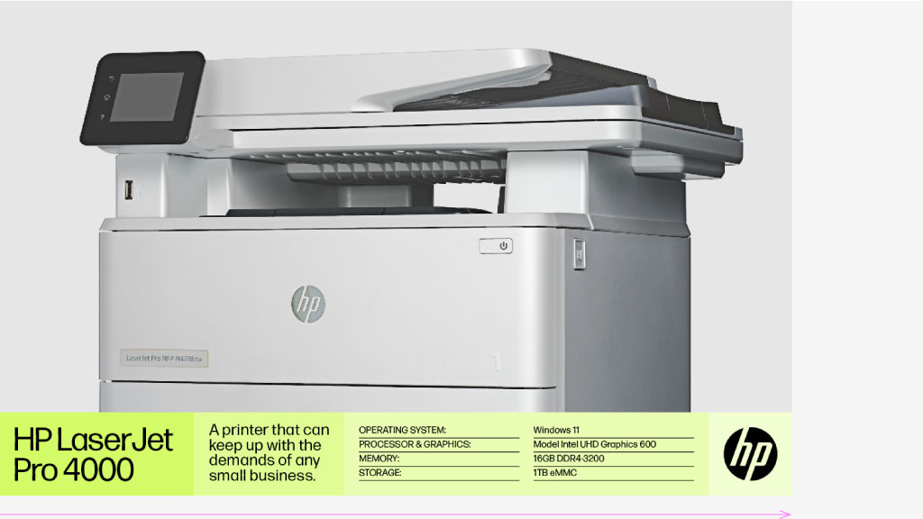
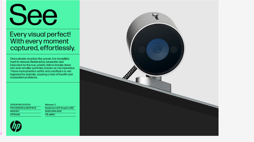
The logo acts as punctuation, closing out the copy and design. If you place it in the corner of the layout, customers will naturally spot our HP brand time and time again.

Place the logo in the corner of the layout, so it follows the copy and signals the end of design. Your eye should draw an invisible vertical or horizontal line across the layout.

Ensure legibility. You want to spot HP easily without it shouting (it’s a friendly period, not an exclamation point). When imposed over a photo, the logo should never obscure products, people, or critical content.

  • Horizontally stacked layout

  • Vertically stacked layout


Do’s and don’ts

Our logo stands on its own — as an identifier. The logo must be readable. Its letters prominent and clear. Provide space behind the logo for effective contrast and breathing room.

The HP logo shouldn’t be placed into container shapes, altered or embellished in any way. It should only be used in the appropriate colors and never combined with other graphics. 

The following examples reflect only a handful of samples of how to use the HP logo.

Design

Do

Dont

Use the classic HP logo on all materials.

Don’t use the HP progress mark for marketing materials or general layouts.

HP Blue

Do

Dont

Only use HP blue on corporate stand-alone instances.

Don’t use HP blue for communications and marketing materials.

Placement

Do

Dont

Place the logo in the corner of the design, so it acts as punctuation.

Don’t float the logo between pieces of key information.

Space

Do

Dont

Give the logo equal amounts of clear space and breathing room.

Don’t place the logo too close to the edge or lose valuable white space.

Contrast

Do

Dont

Ensure proper logo contrast for crisp legibility.

Don’t allow an image to obscure or hide the logo.

Size

Do

Dont

Match the logo to the baseline and cap type height in the same container. If there is no type or container, match the height to another similarly sized object.

Don’t let the logo float without aligning it with the baseline and cap height.

  • Design

  • HP Blue

  • Placement

  • Space

  • Contrast

  • Size


Co-branding

We take pride in the strength of our partnerships. They enable us to expand offerings, enhance the customer experience, and ultimately drive revenue and greater brand relevance. 

To ensure that HP benefits fully from our ties with other brands, it’s essential that we clearly and appropriately communicate these associations.

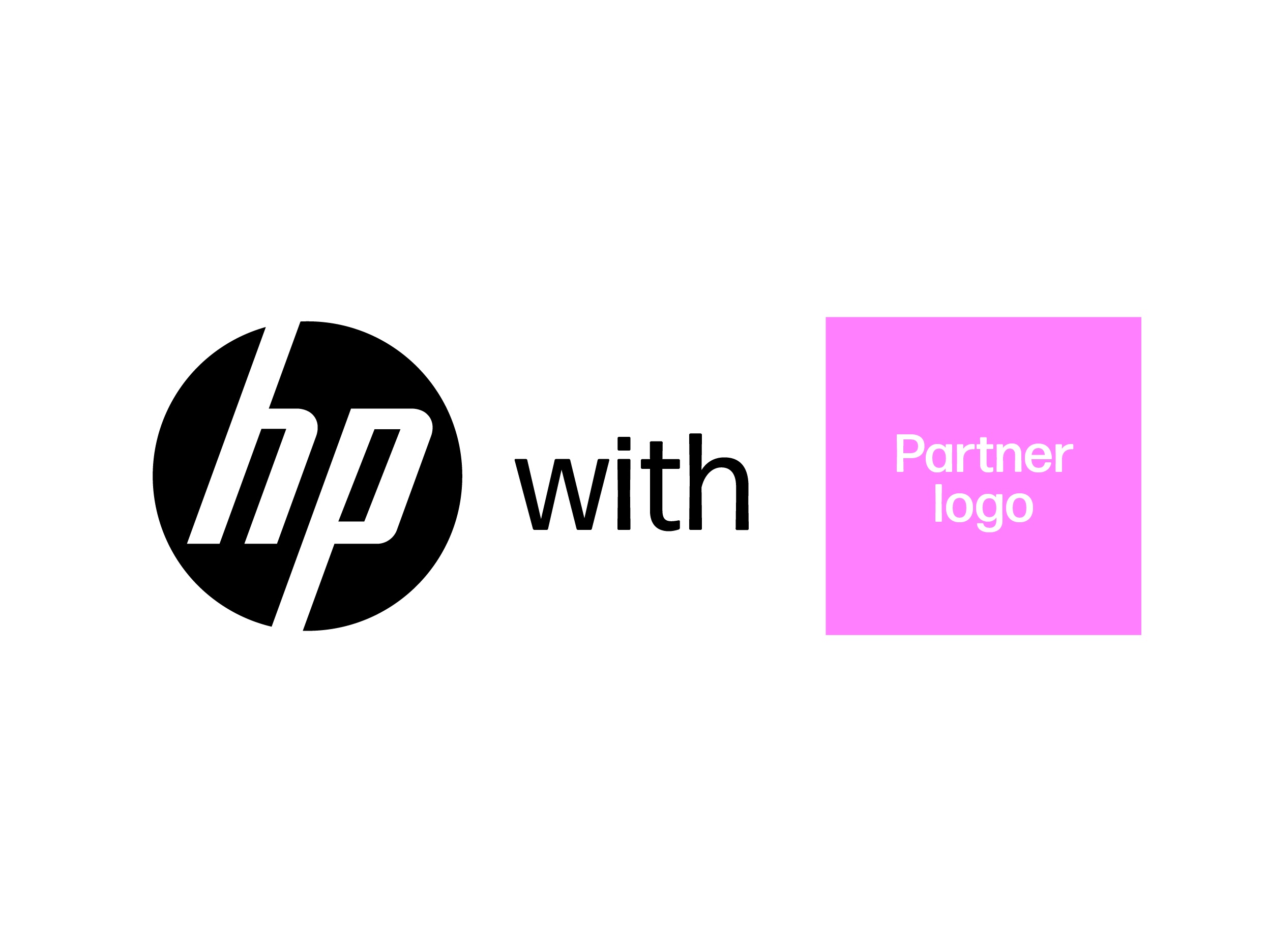
Whenever possible, lead with the HP logo.

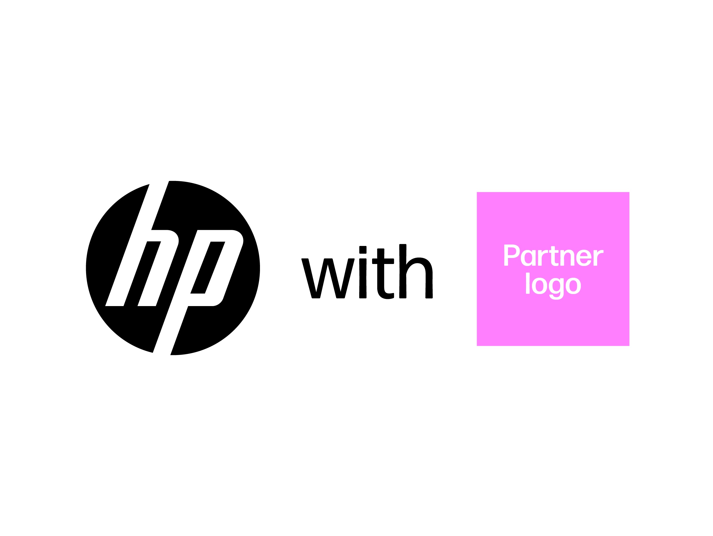
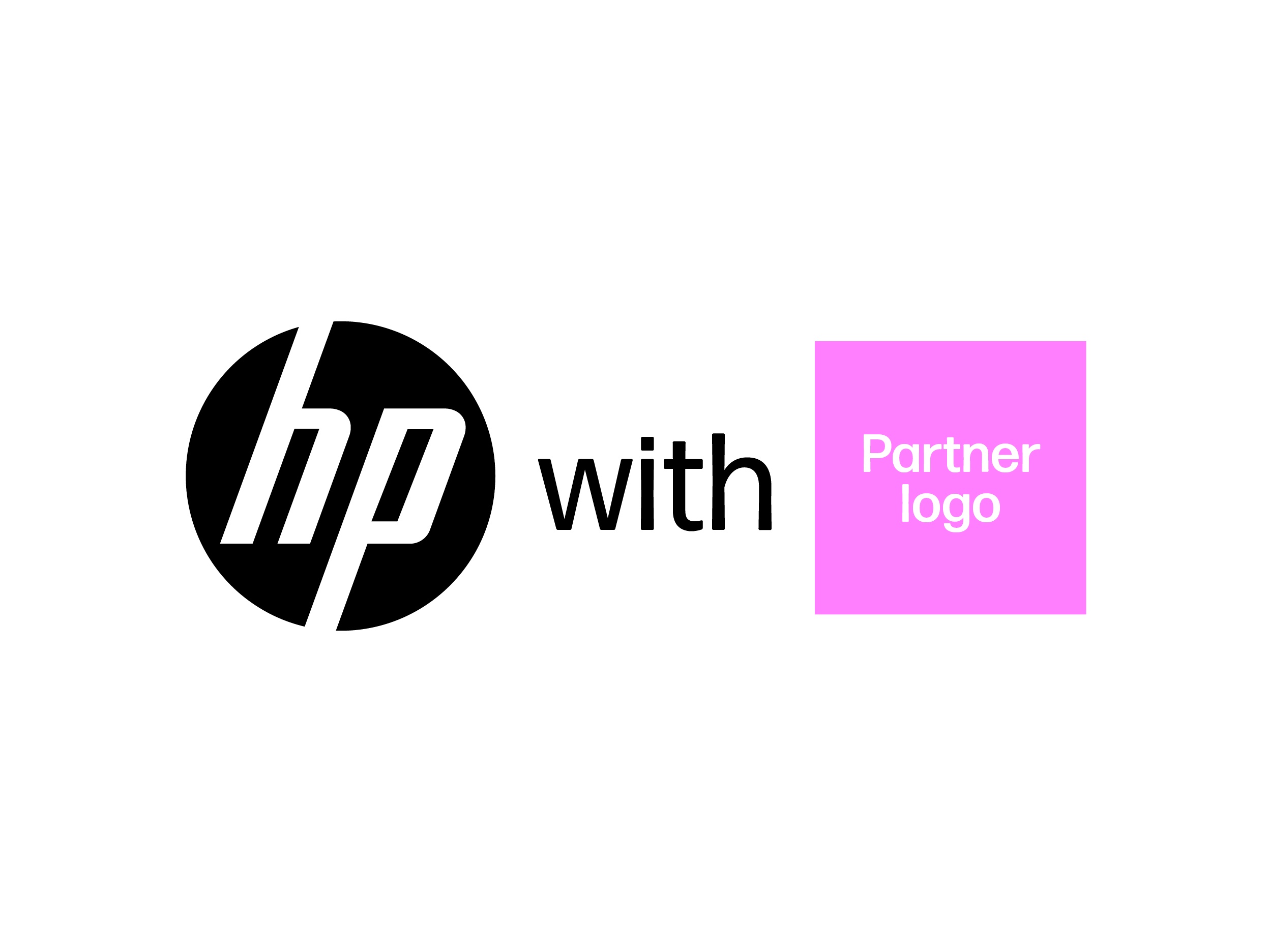
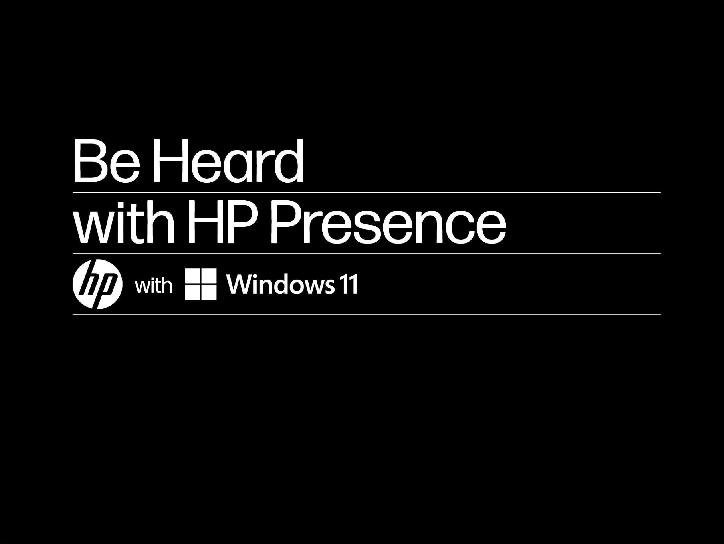
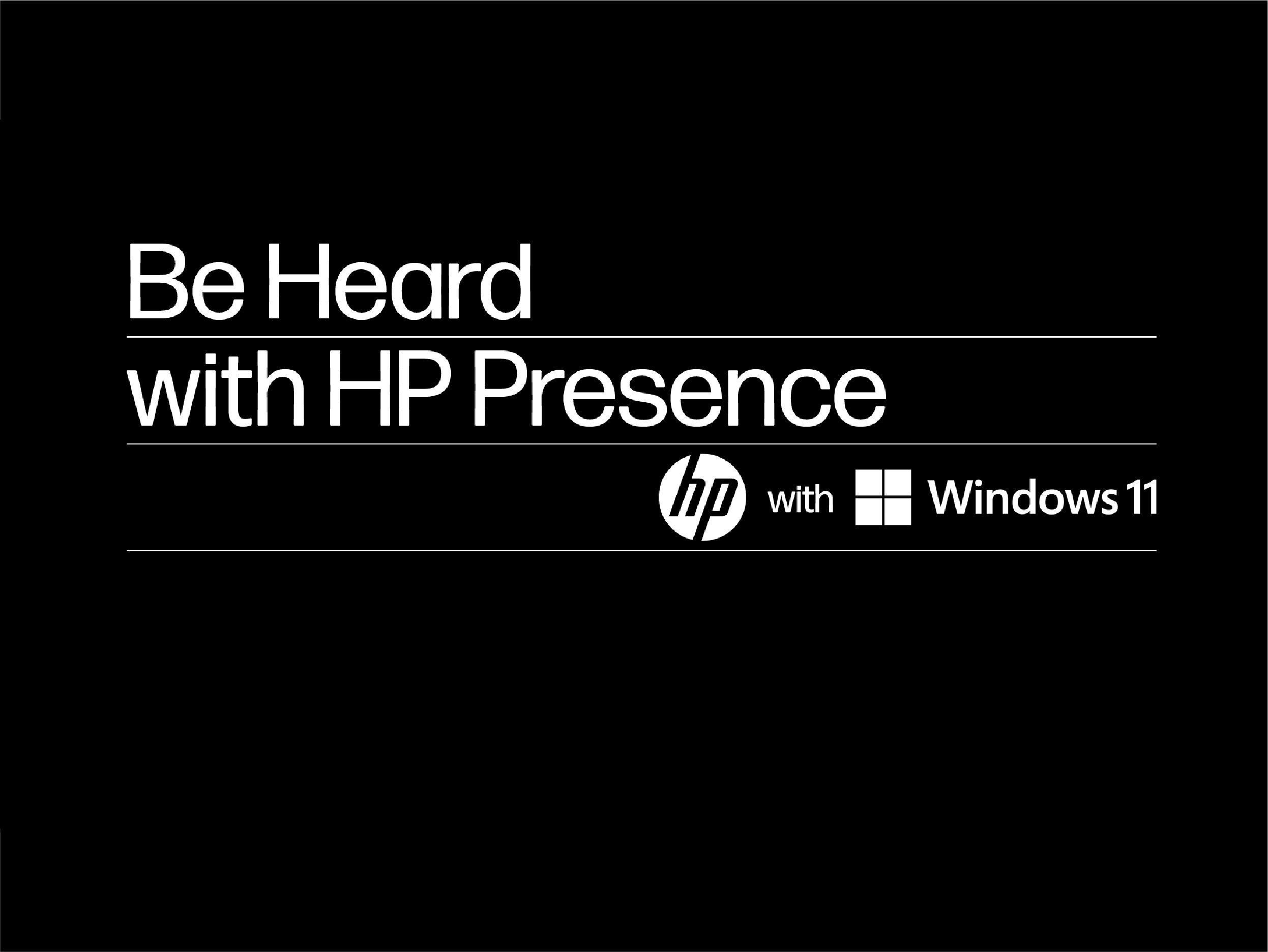
Include the word “with” between the HP and partner logo to indicate the association as a feature, not the focus.

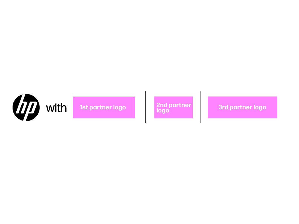
When co-branding with more than one partner, feature the word “with” before the first partner logo. Then, add the other partner logos and apply vertical lines to separate them. 

Size

Do

Dont

Scale the partner logo to 85% of the HP logo and “with” to 75% the width of the HP logo.

If the partner logo is the same size as the HP logo, it will appear larger.

Space

Do

Dont

Set spacing between the HP logo, “with”, and partner logo at roughly 25% the width of the entire HP logo.

Don’t attempt to fit both logos and text too tightly within an area.

Placement

Do

Dont

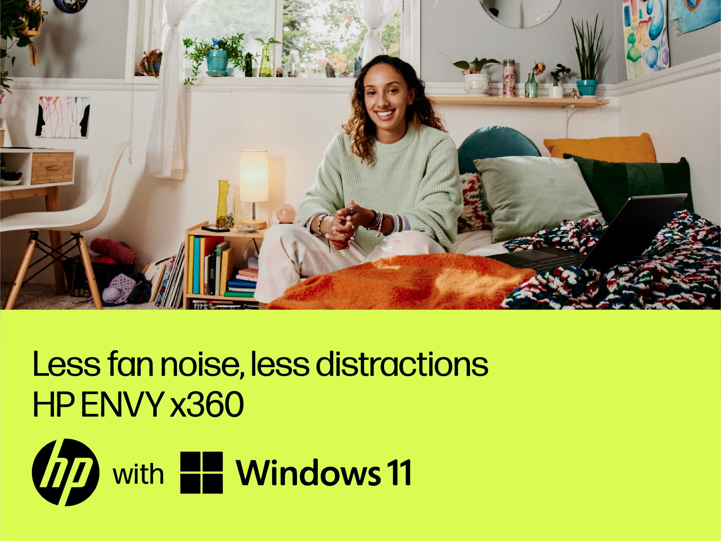
Center partner logos and “with” vertically with the HP logo and horizontally across all elements.

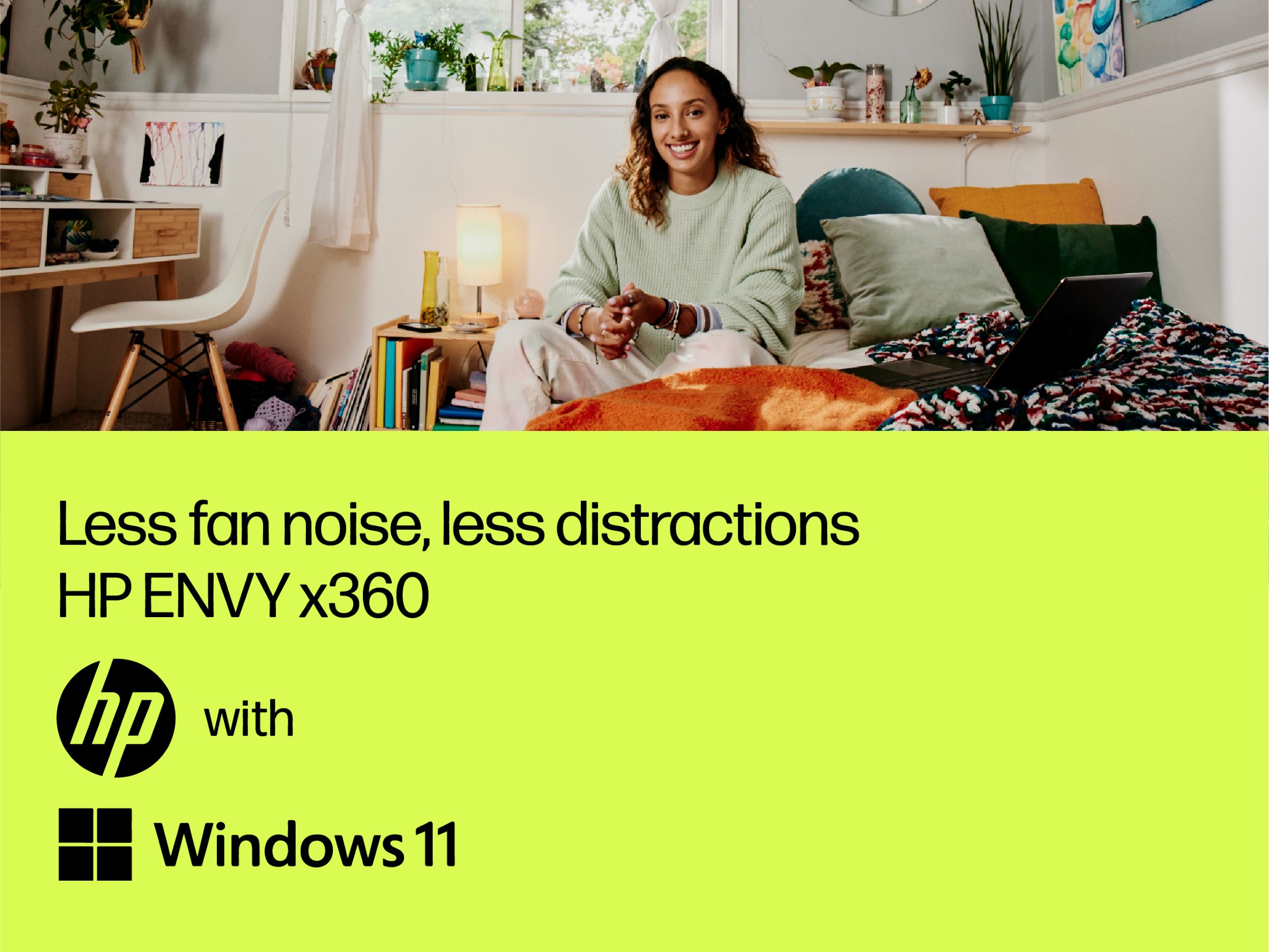
Don’t stack the logos or leave “with” on its own line.

Video

Do

Dont

For videos, fit lockup into a ruled layout. If scale is an issue, create negative space and drop the logos down to the last line.

Don’t crowd the lockup on the same line as text or break the layout flow.

Photo Backdrop

Do

Dont

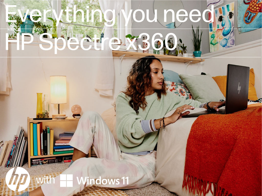
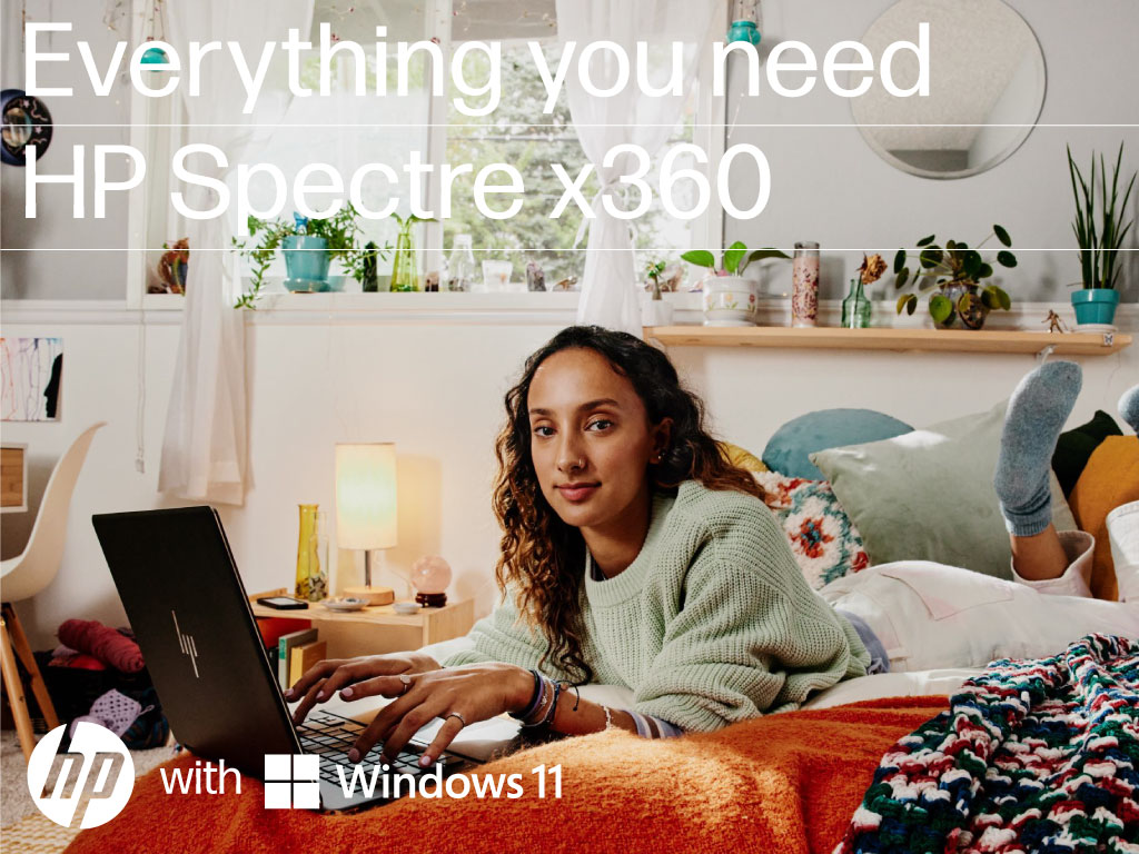
Place the logos as a visible signoff against the backdrop.

Don’t obstruct vital content or place the logos over the product.

Multiple logos

Do

Dont

Space partner logos with vertical lines.

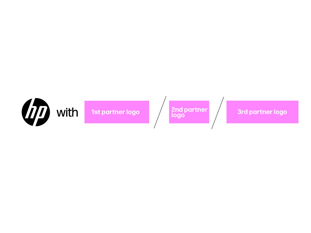
Do not use “x” “—” or other graphics to separate multiple partner logos.

  • Size

  • Space

  • Placement

  • Video

  • Photo Backdrop

  • Multiple logos

Logo use requests

We typically do not allow third parties to use the HP brand or reference it. However, we do make rare exceptions to this policy when appropriate. All requests go through our standard review process. 


FAQ

This are just some of the most questions we receive regarding the use of the HP logo. Make sure you are familiar with the guidelines displayed in this page. In case you still have questions, please reach out to the Brand Central team.

  • Can I modify the HP logo?
    Do not modify the logo or combine it with any other elements (graphic or copy) and do not use the HP logo as a replacement for letters in word or part of another logo. Please refer to the Logo section of this website for more information on logo usage.
  • Can I use the HP logo in other colors?
    The available HP logo colors are approved by our Executive Leadership Team and no other logo colors can be created or used without prior executive approval.
  • In which circumstances we use the blue logo?
    The blue logo should be the primary option for all corporate applications. Use the blue logo to proudly display our heritage and solid reputation everytime HP is presented as a unified company and in all employee communications.
  • What happens to the progress mark?
    The progress mark is reserved for specific product categories and limited to product design and packaging. It is not to be used for communications and marketing.
  • How the new identity affects other sub-brands like Wolf, OMEN, Z by HP, and HP+?
    OMEN and Z by HP and Wolf Security will continue to have unique brand identities. Please refer to the specific OMEN and Z guidelines. In the case of HP+, the Print Marketing team will continue to work off existing playbooks but is exploring ways to incorporate HP+ in the new Vis ID framework.
  • Can family brands have their own independent identity from HP? What are the guidelines for creating sub-brands?
    All HP family brands and sub-brands are approved by the Executive Leadership Team. Before creating any product or solution brand, reach out to a brand manager on your business group or to the Brand Central team.
  • I want to create a logo for my group. Can you tell me the rules I should follow to ensure it meets the HP standards?
    To maintain a strong, singular brand for HP, organizations should not create any visual assets that represent a group, team, department, club, program, etc. That includes, but is not limited to logos, icons, emblems, insignias, images, and drawings. If there is a business reason to create a new logo, please reach out to the Global Marketing or Corporate Brand team to know how to proceed.
  • Can I lock any taglines with the HP logo?
    No taglines can be locked up with the HP logo.
  • What is the process to approve a third party (vendor, supplier, partner) to display the HP logo in their communications, showcasing our connection with them?
    Limitation of usage of our brand by a third party is usually covered in the business contract. We do not typically allow 3rd parties to use the HP logo or reference as it denotes endorsement for that vendor or solution. To make sure we limit, monitor, and track those who want to use the HP brand, we ask that all requests are submitted to the Brand Central team.